As I was compiling my list of unique colors, I realized that we’re due for a more specific round-up: It’s time to put together examples of super loud, fun, and bright colors! These are hues that help fashion, art, decor, and graphic design POP with neon excitement.
First, some background about the person creating this article. My name is Lillie, and I’m an artist and teacher who has written numerous articles about colors — from how to spell fuchsia, to the meaning of the mysterious color, Viridian.
All illustrations in these lessons are hand-drawn by me, and the ideas come from personal, hands-on research — as well as study. Ready to dive into the list… starting with what green and yellow make when mixed together? Let’s go!
Bright Colors
Ready for a round-up of delightfully bright colors to add vibrant neon zest and flair to your next art, fashion, decor, or graphic design project? Of course, the primary colors, red and yellow fit the bill -- but what about more complex options made by mixing colors together? Let's find out!
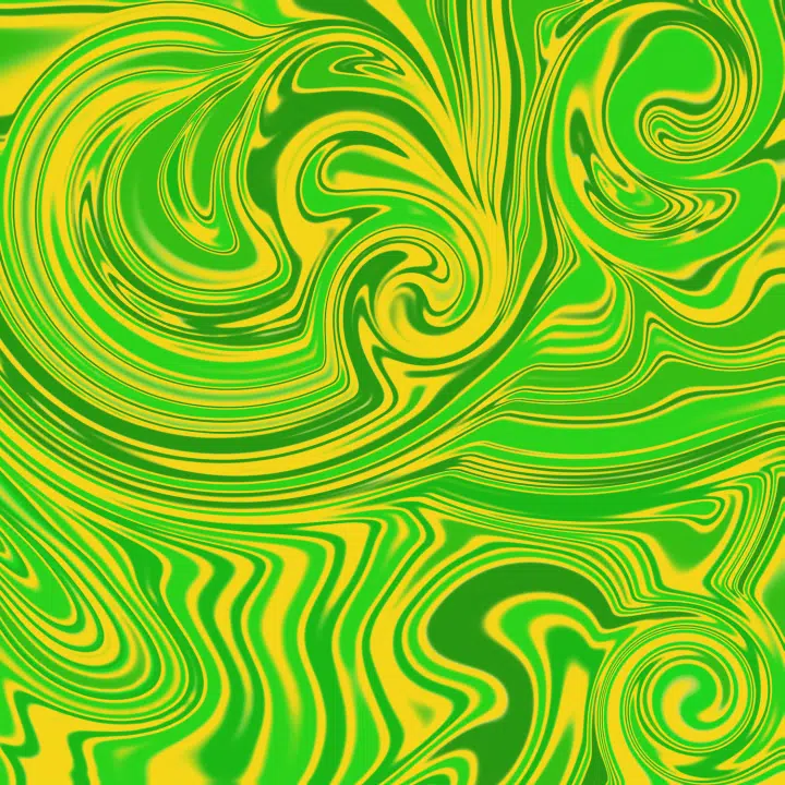
Chartreuse
Mix the primary color, yellow, with the secondary color, green, and you get the wild yellowish-green neon called chartreuse!
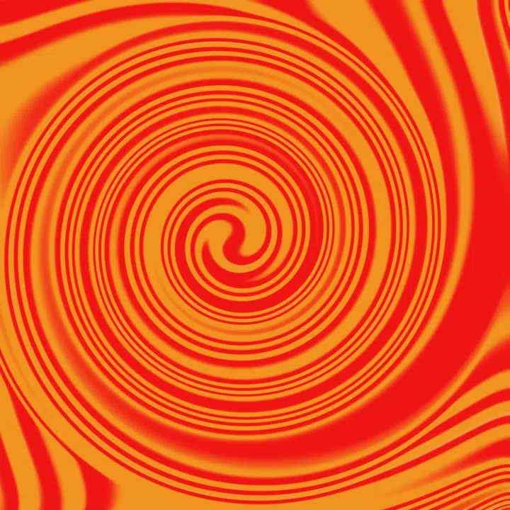
Vermilion
Another intermediate color is vermilion: the blazing orangish-red made by mixing red plus orange. It's like fire, incarnate.
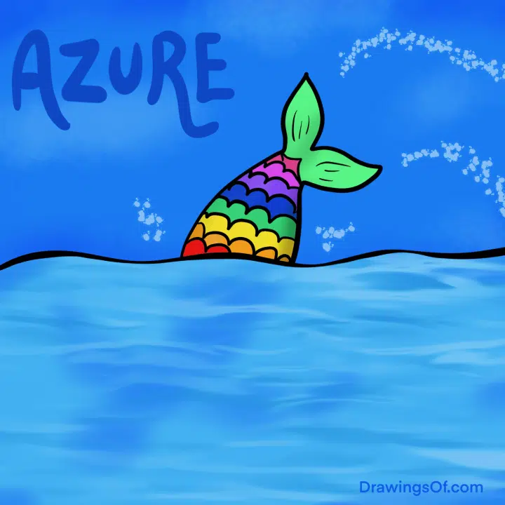
Azure Blue
Though most colors that "read" as bright are on the warm side of the color wheel, the cool color, azure blue, fits this category because it's the joyful, clear color of a perfectly cloudless daytime sky.
Orange
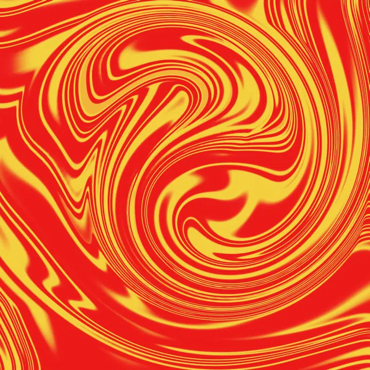
The simple secondary color, orange, is the quintessential bright color -- created by swirling red and yellow together.

Hot Pink
Put together a darker pink with some purple and you get the wonderful color, hot pink! This is a particularly fun one to use in fashion.
Amber Color
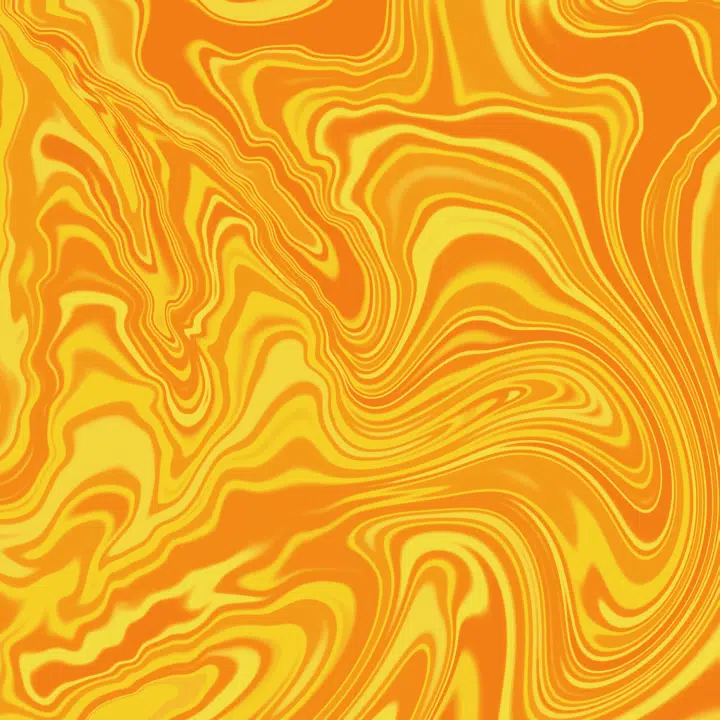
Whirl orange and yellow together, and they yield amber: a sunny yellowish-orange. This is always a juicy accent color.
Salmon Color
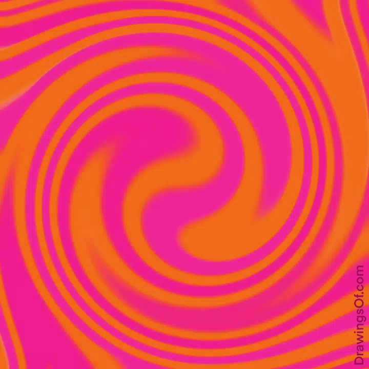
I almost put peach (what pink and yellow make) on this list, but it has too much white in it to be truly "bright" -- it's more of a pastel color. That said, I AM going to add its sister hue, "salmon color" here in this round-up, because it's made by adding pink to orange, and if you choose a dark enough orange, the result is absolutely rich and saturated enough to be considered bright.
Fuchsia Pink
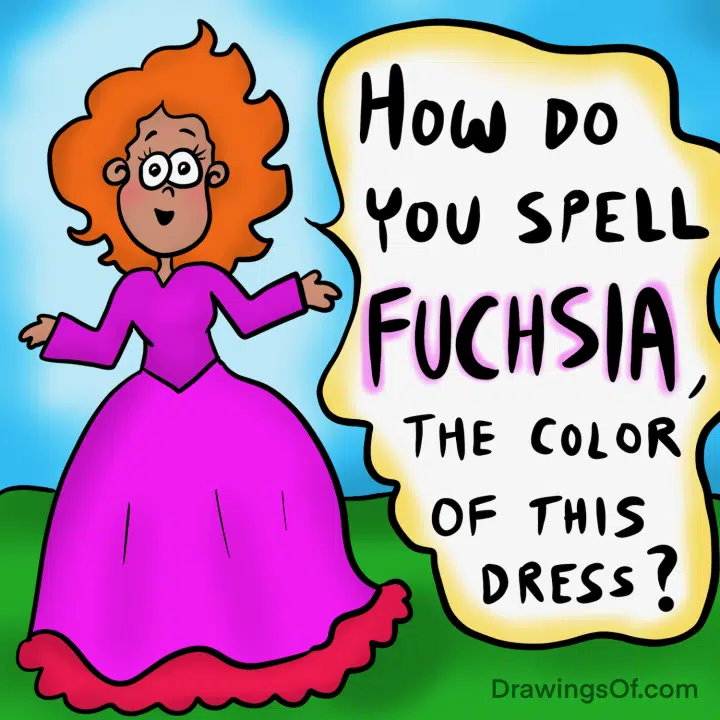
Though it's close to hot pink, fuchsia is a delight of its own, as it has more purple in it. As a side note, it's also very difficult to spell!
What Makes a Color “Pop?”
Did you notice a pattern in our list? That’s right: Most “bright colors” are WARM colors, meaning that they are in the red, orange, and yellow side of the color wheel (as we found out in “Is Pink a Warm Color?”).
That said, cooler colors like greens CAN be bright as long as they have enough yellow in them (like chartreuse), and blues can seem bright if they’re saturated and clear enough (like azure color). Meanwhile, purples can read as vibrant when they have lots of red in them, as with fuchsia.
The Secret to Brightness
The key with creating brightness is high saturation (lots of pigment and less white or black added), and low “muddiness” or “dustiness.” What do I mean by “muddy” or “dusty?” I mean colors that look brownish or grayish, such as what orange and blue make.
Since we know that the answer to “What colors make brown or black?” is: “Brown and black are created by mixing all three primary colors in the RYB color model: Red, Yellow, and Blue,” here’s the trick to avoiding dustiness: Make sure there’s zero of ONE of the primary colors in your combo. In other words, create your color from just TWO primary colors.
Here’s an easy way to do that: Look to “Intermediate Colors” (sometimes called “Tertiary Colors“) which are created from the combination of one primary color with the secondary color next to it. This works to produce a vibrantly bright, clear color because by definition, the third primary color is excluded — and thus brown or black results don’t happen.
Bright Colors, in Sum
I hope this round-up of bright colors has made you smile, and given ideas for ways to add pizzaz and flair to your next project. I’m particularly partial to vermilion (what red and orange make), myself. Which is your favorite entry in this list? Do share!

The author and artist, Lillie Marshall, is a National Board Certified Teacher of English who has been a public school educator since 2003, and an experienced Reiki practitioner since 2018. All art on this site is original and hand-drawn by Lillie. She launched DrawingsOf.com Educational Cartoons in 2020, building upon the success of her other sites, AroundTheWorldL.com (established 2009), TeachingTraveling.com (founded 2010), and ReikiColors.com. Subscribe to Lillie’s monthly newsletter, and follow @WorldLillie on social media to stay connected!
