Sometimes in the course of adding to our giant color mixing chart, I stumble across a color that becomes one of my all-time favorites. Azure color — blue like the clear sky — is one such example! Let’s examine how to make it, where to use it, and why it’s great.
First, some background. My name is Lillie and I’m an artist and teacher who revels in answering pigment-swirling articles such as, “What does red and green make?” using hand-created experiments and illustrations.
Ready to dive into azure — one of the most stunning shades of blue imaginable? Let’s go!

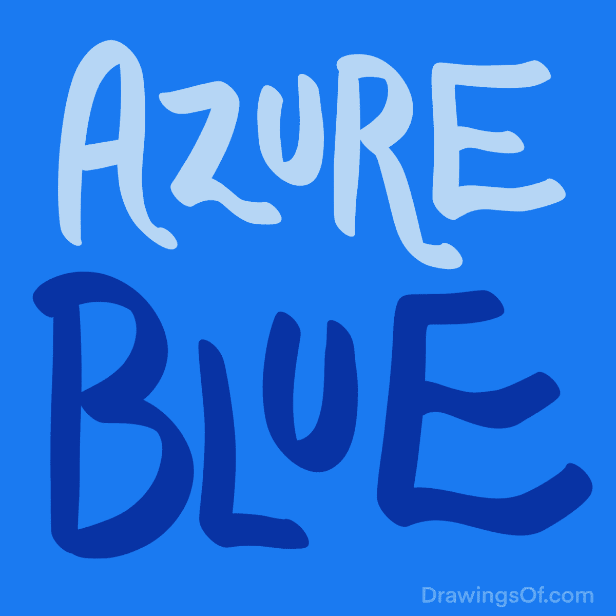
Azure Color
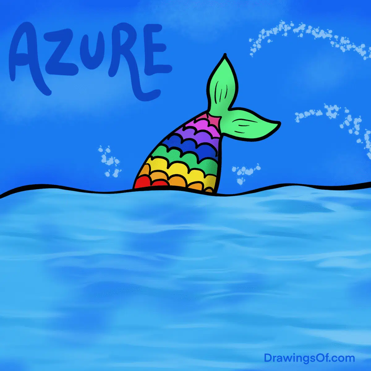
How do you make azure color, and what is it? Picture the most perfectly clear blue sky on a summer day, or the most tranquil ocean waves (mermaid tail drawing and all), and there it is.
Though azure is a cool color (an easier answer than “Is pink a warm color?”) this blue is remarkably cheerful, calming, and cleansing. Think about its mood-boosting powers this way: It’s hard to be in a bad mood on a day with glorious clear skies! (In contrast, the shade of the NIGHT sky is midnight blue color.)
How to Make Azure
In the RGB color wheel, azure blue is the exact midpoint between the primary color, pure blue, and the light greenish-blue called cyan color. As for paint or food coloring purposes, as we discussed in our article, “What does green and blue make?” the outcome of mixing those pigments can be anywhere from teal to… azure! For the HTML and computer folks out there, the HEX code for azure is usually #007FFF.

Uses for this Color
Given that I’m an English teacher in addition to being an artist, I feel the need to point out that “azure” is one of those words that make you sound smart. For example, the next time you’re describing a dreamy beach vacation, write about the “azure waves” of the ocean! Sounds classy and evocative, right?
For design, azure is the opposite of orange in the RGB and CMYK color system, so if you put those two colors together, they are complimentary, meaning they really pop off the screen or page.
As for fashion, I find azure blue to be one of those colors that’s both professional AND exciting — like midnight purple, or my new super-favorite shade, viridian color. Wear it for work clothes and you look put-together and cheerful, but not overly flashy.
Azure Color, in Sum
I hope you’ve found this exploration of the gorgeous color (or colour, if you’re British) azure blue to be enjoyable. Is it a hue you enjoy, too? Where do YOU use it — either in your art, your writing, or your fashion and decor? Do share!
Want more? Check out my piece on terracotta color, and my big round-up of other unique colors…

The author and artist, Lillie Marshall, is a National Board Certified Teacher of English who has been a public school educator since 2003, and an experienced Reiki practitioner since 2018. All art on this site is original and hand-drawn by Lillie. She launched DrawingsOf.com Educational Cartoons in 2020, building upon the success of her other sites, AroundTheWorldL.com (established 2009), TeachingTraveling.com (founded 2010), and ReikiColors.com. Subscribe to Lillie’s monthly newsletter, and follow @WorldLillie on social media to stay connected!