As an artist, writer, and teacher, I’ve done so many color mixing experiments by now that I thought I knew all the colors out there… but, wow, was I wrong! Just yesterday I learned about one of the most beautiful, exciting, and alluringly-named colors I’ve encountered in a long time: midnight purple color!
What is Midnight Purple?
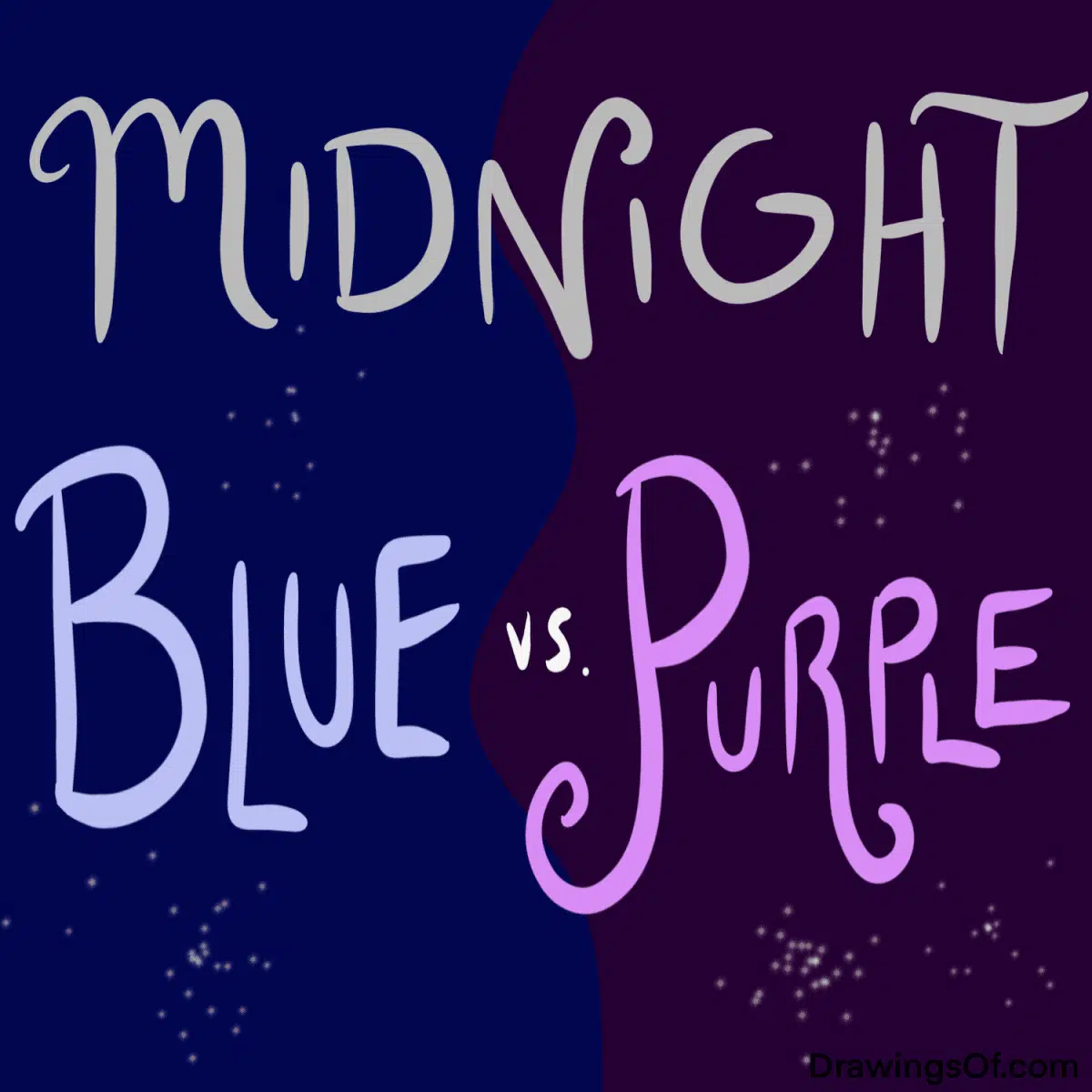
Most of us have heard of the color called midnight blue, right? It’s that rich, very dark blue that looks like the sky in the middle of the night — almost black, but definitely glowing with the cool luster of blue.
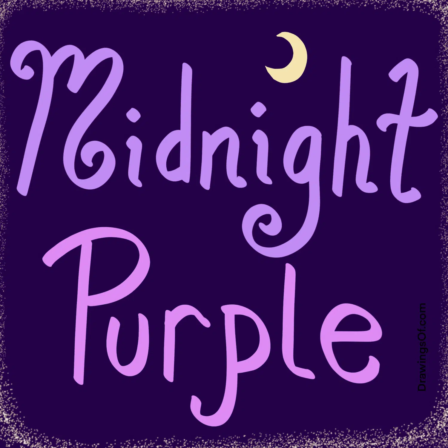
Well, midnight purple color is the same idea as midnight blue color — just with purple! Midnight purple is such a dark purple that it almost looks black… but it’s actually just a truly deep shade of my favorite of the secondary colors: purple. Here is my illustration of what it looks like.

How to Make Midnight Purple
How do we make this wonderful color? First, let’s back up and review the answer to “What colors make purple?” The answer (in the RYB color model) is that red and blue make purple. Next, to make it the dark, dark shade we’re looking for, just add black!
Now, a warning: as we may recall in our exploration of how to make brown, any time that all three primary colors (red, yellow, and blue) are combined, they make the muddy neutral brown color. Because we want our midnight purple to be rich and clear, we want to avoid making it muddy — but how?
The key is in remembering that purple is red plus blue — meaning that to avoid brownish muddiness, we shouldn’t add yellow to the mix if we want the result to be non-muddy. Indeed, yellow and purple make a browner, grayer, or generally more dusty neutral than what we want, and purple and brown make the color plum — again more brown than what we want. The key to midnight purple is that it should be saturated and rich.

Where to Use this Exciting Color
Midnight purple color (or colour, if you’re British) is thrilling to use in many realms — fashion, decor, design, etc. — because at first it seems subdued and professional because it’s so dark… but upon further investigation, the zest of the purple pops out! Some designers even add sparkles or opalescence in the mix to emphasize this unique flavor, which I’ve tried to recreate by drawing in some light yellow stars in my illustrations, above.
The place where I see this color used most often lately is in car paint and vehicle vinyl wraps. I admit I’d be intrigued to have this paint job, myself! It looks nice next to viridian green.
Until I can afford it, however, I’ll have to be content with wearing the color on a dress, or decorating my Reiki studio with it as a nod to the power of the purple aura of the Crown Chakra mixed with the black aura of the Earth Star Chakra.
Midnight Purple, in Sum
I hope this article has helped you learn about midnight purple color, and has assisted in fleshing out how it’s mixed, paint-wise, and several of the fun ways it’s used. So what about you?
Are you a fan of this mysterious, regal, magical late-night color? If so, where do you like using it? What are your other favorite unique colors? Do share!
Want more? Check out my pigment-adoring articles on terracotta color, or the cheerful clear blue sky hue of azure color.
If you want a little taste of my English teacher side (versus the artist one), learn about the frequently-used but actually misspelled word, “seperated!”

The author and artist, Lillie Marshall, is a National Board Certified Teacher of English who has been a public school educator since 2003, and an experienced Reiki practitioner since 2018. All art on this site is original and hand-drawn by Lillie. She launched DrawingsOf.com Educational Cartoons in 2020, building upon the success of her other sites, AroundTheWorldL.com (established 2009), TeachingTraveling.com (founded 2010), and ReikiColors.com. Subscribe to Lillie’s monthly newsletter, and follow @WorldLillie on social media to stay connected!